


A ServerWise five part Series
Get Intimate With The Color Wheel To Do Your Own Design Branding And Don't Be Afraid To Crowdsource To Get It Right The First Time
No one knows your company and brand strategy better than you. That’s certainly what my wife and I thought when she started her niche membership site. We priced what a professional brand ID service would cost, and we decided to save the money ($1,500 at that time) and give it a go on our own.
I’m proud to say we got most of it right, with one major exception – our brand colors.
Your brand palette is more than just your personal favorite colors. These are the colors that will represent your brand everywhere, and they must appeal to your buyer persona – your core demographic. If you want real success, you have to step away from your own color preferences – a lesson I learned myself.
I don’t like the color pink.
It’s not because I perceive it as feminine or ‘girlish’ – I just don’t care for it, and neither does my wife. We have actively avoided using any pinks or associated hues of pink anywhere. It’s just not a personally appealing color to us. But here’s what I learned – that doesn’t matter.
Our buyer persona loves pink. In fact, muted pink hues made our demographic feel feminine, happy and refreshed. So goodbye green logo and hello light powdery pink logo.
I uploaded our new logo on a Wednesday night, replacing the green for pink across every platform. That included our website and store, social media accounts and Facebook Group.
What happened?
Friday morning, our engagement had climbed 30%.
Shares of our posts and products on Facebook did even better, with a 32.5% increase.
We did what was right for our buyers, and we were rewarded.
What did I learn? Image matters.
Don’t let your personal interests or preferences get in the way.
These are the three things I should have done in the beginning:
- I should have educated myself. Looking back, I needed to sit down with the color wheel and read a book, article or watched a quick video. There are so many ways I could have learned how the colors relate to each other.
- I should have looked up basic color psychology. This would have helped me know what our demographic likes, dislikes and feels when she sees green versus pink.
- I should have created at least two versions of our logo. One version with the color my wife and I wanted (forest green) and the other in a pink hue. With a few different versions to compare, I should have asked a couple friends that match up with our buyer persona for their opinion. If I had done that, I could have saved myself hours as I switched from green to pink across all platforms.
Before we jump into my personal interpretation of the psychology of color and why it works and where it doesn’t, let’s get into the color wheel real quick.
A color wheel consists of colors with the following distinctions: primary, secondary, tertiary, complementary, and analogous.

Color Wheel Basics
You can just as easily skip these definitions. I’m putting them here in case anyone is interested in the traditional basics of the color wheel.
- Primary colors can’t be created by mixing other colors together, such as red, blue, and yellow.
- Secondary colors can’t be produced by mixing two primary colors such as orange, green, and purple.
- Tertiary colors are created by mixing primary and secondary colors.
- Complementary colors are located at direct opposite ends of the color wheel from one another and match well visually.
- Analogous colors appear close together on the color wheel and have similar visual traits. Essentially they are related colors, which means they’ll work together without being jarring or getting too much attention. These colors are great for website use; headlines, content subheads, table of contents, bylines, etc.
Quick Overview on Color Psychology In Marketing & What They Always Leave Out
We’ve all seen the popular infographics spread around on Pinterest. The ones that have the color, the alleged emotion that color invokes and logos of the various known brands that use it. Here’s one in case you’re not sure what I’m talking about:
This is an elephant in the room situation here, so let’s deal with that first. I’ve noticed that most writers when writing about psychology of color when used in brand identity and marketing source the study titled Impact of Color on Marketing by the Emerald Group that found that:
"People make up their minds within 90 seconds of their initial interactions with either people or products. About 62‐90 percent of the assessment is based on colors alone. So, prudent use of colors can contribute not only to differentiating products from competitors, but also to influencing moods and feelings – positively or negatively – and therefore, to attitude towards certain products."
Emerald Group, 2006
Marketers have been using this study for years, but let me tell you why you shouldn’t.
The study is old. 2006 is outdated when it applies to marketing in the digital world. Consumers have become inundated with color psychology. A lot of consumers have read about it themselves and witnessed the flashy, colorful infographics on Pinterest. The more consumers are aware of how marketers use colors to push emotions to sell products or generate leads, the more immunity they build up to the experience.
The study specifically mentions that colors can be used to differentiate products from competitors. This is the most important takeaway of the study in my opinion, so if you retain nothing else, remember that.
The study doesn’t take into account the fact that consumers have had 15 years since the study was conducted to experience new brands that turned the very findings of the study upside-down by using colors that shouldn’t work.
We’ve Grown As Marketers Since 2006
What we’ve learned as marketers since 2006 is that it’s not always the direct association with the color that consumers experience but rather the appropriateness to the brand.
Does the color of the logo for this particular brand fit the product and niche?
Consumers are inundated with colors everywhere these days. On phones, tablets, streaming services and advertising. In my opinion, we can no longer assume that if you have a masculine brand you must use masculine colors to evoke masculine-related emotions, such as blue for strength or black for power.
Take the Syfy channel for example. The current Syfy logo is dark purple, which they released as part of their rebranding in 2009. Before that they were known as Sci-Fi with an even lighter purple logo.


What is my point?
Don’t pay too much attention to the psychology of your color choices. Base your brand identity color palette on two things:
What colors do your competitors use, and how can you use color to set your brand apart?
If your competitors mostly use bright, cheery colors, consider going monochromatic to set yourself apart. And if your product is marketed to women and your competitors lean into that by using purples, pinks and light tones, consider going bold with deep color choices that stand out.
What colors do your buyer persona (customer base) dislike?
Color is just as much cultural as anything else. Our perception of color goes back to our childhood, beliefs, experiences and cultural upbringing.
Before you solidify your color choices for your brand identity, ask around. Surely you know a handful of people that represent your consumer base for your product. Reach out to them and ask for honest feedback. You may want to reward them with a free product sample to show your appreciation.
Using The Traditional Color Wheel To Choose Your Colors Yourself
Find a color wheel online. Most likely, you have a general idea what main color you want to use in your brand identity. Of course, one color is a good start, but it isn’t enough. You’ll need complimentary colors to use throughout your social media posts, infographics, website, store, signage and anything else representing your brand.
Track down your chosen color on the color wheel. Now look to the left and right of that color – those are your analogous colors that will fit well when combined.
Now look at the color directly across from your base color. That’s the color that will directly compliment your base color.
Once you’ve made your color decisions, select to see both the HEX and RGB codes for each color in your new brand identity palette. You’ll want to write those codes down and keep them handy. Those color codes will be used everywhere to represent your brand. After all, consistency is important. Consistency creates trust and a sense of reliability.
Would You Rather Have Professional Brand Palette Recommendations In Two Minutes?
This is not an upsell. No affiliate marketing here or ad linking. Just my honest opinion based on years of experience and many mistakes.
Enter Canva (I’ll explain more below).
Canva (my tool of choice) has a short but insightful video series on brand identity and color. You don’t have to be a Canva user to learn from it.

The Tool We Used To Get Our Color Palette Right - Finally
Finally, my wife and I accepted the fact that we chose the wrong base color for our logo. We needed to accept the fact that we didn’t know what we were doing.
Once we adjusted our mindset and set aside our personal color preferences, our buyer persona told us we needed to switch it up. We had to use pink instead of forest green. I did a lot of research into color psychology and creating a brand identity through color.
Through it all, I realized that the former and widespread ideas of color were outdated and irrelevant. Our demographic of potential members wanted pink, so that’s what we did, but that only started the brand identity process.
We had our main logo color – pink, but what about our site colors that included headlines, membership tools, etc. We needed to develop our complete brand color palette, and we needed to do it quickly.
Canva saved us. I inputted our base pink color using its HEX code into the Discover Palettes feature, and we had our new and perfect color palette in a click.
We insisted on that forest green for too long. I often wonder whether our membership numbers would be higher now or would have grown faster had we chosen the correct color palette for our buyers in the first place. I choose not to live with regrets, though.
Canva
I realize I’ve already recommended Canva (and no, ServerWise and myself does not have an affiliate relationship with the company) but that’s because I’m a big fan. The service is cheap and I use it daily.
Brand Palette Suggestions
Canva has a handy tool you can use to receive professional brand identity palette recommendations.
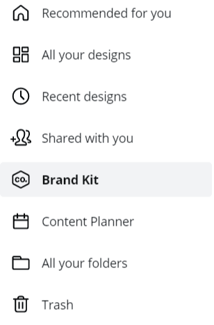
Click on Brand Kit on the left side menu in your Canva account (you can sign up for free).
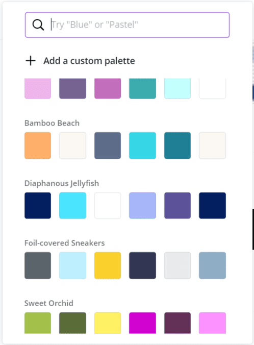
Now click on ![]() and the following magic box will appear allowing you to search, filter and preview hundreds of professionally assembled color palettes. It doesn’t get easier! Take the colors your competitors are predominantly using and search for their opposites – be bold to differentiate yourself in the marketplace.
and the following magic box will appear allowing you to search, filter and preview hundreds of professionally assembled color palettes. It doesn’t get easier! Take the colors your competitors are predominantly using and search for their opposites – be bold to differentiate yourself in the marketplace.
You have your brand identity down and your color palette set. Now comes the value of branding consistency throughout all platforms, networks and communications as you develop your central message of your brand.
POSTS IN THIS SERIES
- Intro To Brand Identity In Coaching and Membership Sites Series & Why Should You Listen To Me?
- First You Must Design Your Brand Identity Plus The 3 Questions To Ask A Designer or Best Sites To DIY
- Get Intimate With The Color Wheel To Do Your Own Design Branding And Don't Be Afraid To Crowdsource To Get It Right The First Time
- Be Consistent With Your Brand Identity Everywhere But A Clever Marketer Knows The Power Of An Unexpected Switch Up
- How To Use Authenticity As The Foundation Of Your Long Term Growth Strategy While Staying Genuine
- Delete Those Stock Images If You Want Real Branding And My 5 Tips On Working With A Pro Even When You're Not


Leave it to brands like Canva, Wendy’s and Slack to turn the once-dreaded 404 error page into a play space. Introducing the gamification of the error page and people are loving it. Keep Learning >

Imagine a magical platform where you can share your first video with zero followers and suddenly have millions of views. Sounds unbelievable, doesn’t it? That is the current power of TikTok and many small and local businesses have experienced the sudden impact of a viral post on the young platform. Keep Learning >