How and Why We Moved To A System Font Stack in WordPress With No Regrets
Table of Contents
We moved ServerWise.com to a system font stack a year ago. We severed all ties with Google Fonts and haven’t looked back.
It’s nice to know we’re in good company. Booking.com, GitHub, Medium and Unsplash are all running on system font stacks and have been for several years now.
What happened? Our site speed increased by nearly 6%. That may not seem like much, but it adds up, and it matters especially to those viewing this site on mobile phones and on slower internet connections.
The Four Font Options
Let’s take a quick look at the four font options you have to choose from:
Host Web Fonts Locally: You’ll have a slightly superior speed, and you can still choose from any web fonts you want, including custom premium fonts, Adobe and Google. The catch here is that the fonts still require download time, and if you have a popular site that could mean hundreds of thousands of 200kb downloads a day.
Web Fonts: Beautiful typography with nearly unlimited choices from Google, Adobe (TypeKit), and Font Squirrel. These fonts must be downloaded by the browser via a heavy JS script which adds to the page weight and decreases your page load speed, especially on mobile devices.
Web Safe Fonts: Doesn’t require download time but are considered a legacy font class meaning they look old and are rarely used. Imagine reading this article in Times New Roman. No, thank you.
System Fonts: So-called because they’re already present on your system as part of your native operating system. They’re attractive, and you’re accustomed to them because they are all over your computer, tablet or mobile. The best part is that no download is required and your page load speed is unaffected.
Advantages of Using System Font Stacks
More font weight options. This may not sound exciting to you but, trust me, it is. WordPress includes two font options – normal and bold. A few of the WP page builders, primarily Elementor, gives you more options built in (400, 500, 600, and so on). But those options come at a price because they add the extra command to your font style. If you vary the font weights throughout a long page or post, and you’re using Google Fonts, some users on mobile will have a noticeably slower page load time. A system font lets you add variations such as light and heavy as additional options without weighing down your page.
No downloads. You only serve up the base instructions of your preferred fonts on each device. The user’s own operating system supplies those fonts.
No JavaScript call or API. The Google Fonts API, JS and the Web Font Loader deliver beautiful font types, at only the cost of your site speed. We removed all Google Fonts.
Getting Real About Google Fonts
Let’s get real about Google Fonts for a moment. Great idea and we’ve all used them, but the Google Fonts API has low priority. It’s a free service, so we get what we pay for, as is usually the case. The Google Fonts API loads at sporadic speeds and at times is offline altogether meaning your fonts look terrible.
Switching to a system font stack means no more Google Fonts dependence. In fact, you’re not dependent on any service or server to deliver crisp, clear font classes to your site.
Things You May Not Know About Google Fonts
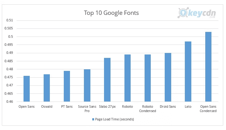
Google fonts load at different speeds.
That’s right, it’s been tested and retested, and it’s true. If you’re using three different Google fonts on your site for headlines, lists, body, etc. those fonts are loading at different rates. The kind folks at KeyCDN tested and compiled the results.
Not everyone can see them equally.
Google fonts, like web fonts, appear differently based on the browser and operating system and connectivity. If your site visitor is out of India and viewing your site on a 3G connected mobile using the Chrome or UC Browser that visitor will have a different experience than a US visitor on a high-speed connection with a Windows-powered laptop.
Google’s servers can be erratic.
We’ve experienced Google Font API and CDN load time fluctuations from 122ms to 641ms per font style, within the space of three minutes. For all its server power and many data centers Google prioritizes resources to its money-making services and not its free developer tools. I can’t blame them there.
Google fonts are render blocking (paint times).
A web page’s HTML must be fully parsed before it can be painted or loaded into the browser. Stylesheets, as helpful as they are, block this by forcing the browser to load them fully as well. Because Google fonts (and TypeKit and Adobe for that matter) are called by CSS their downloading delays browser parsing (paint times).
We’ve experienced Google font load time fluctuations from 122ms to 641ms per font style, within the space of three minutes.
SSL handshakes affect site speed.
We all know that Google prefers SSL sites when it comes to SEO and placement on a search engine results page (SERP). In order to use SSL (and everyone should) an extra layer of encryption is added to the connection meaning two additional round trips to establish the secure connected in the browser.
Google fonts are also called via HTTPS which adds two more handshakes to your page before the page is fully rendered and secure. This slows down your first contentful paint scan thereby slowing your site load time.
What Exactly Is A Font Stack?
A font stack is the preferred order of fonts listed in a site’s stylesheet for each browser and operating system. You most likely already use some variation of a font stack in your stylesheet in the event that the preferred web font can’t be downloaded due to a timeout (3-second rule) or other reason.
A typical font stack may look like this:
font-family: 'Roboto', serif;
In the example above if Roboto is not present it tells the user agent to select a serif font as a fallback.
It’s simple, and it works great, but not across all operating systems. If the user doesn’t have the font installed or available, it may choose an unrelated font, giving your site an unpleasant makeover. This may leave your site visitor with an unintended impression of your brand.
Now, some web designers compensate for this possibility by including more fallback options:
font-family: 'Roboto', 'Garamond', 'Arial', 'Helvetica', serif;
In the example above, the CSS specifies the exact order of the several fallback options. The stylesheet has stacked the preferred order of the font.
A system font stack is the same but with a core addition – it also specifies the operating system to ensure the perfect match of font to display. Roboto looks great on Android and Chrome, but not on iOS. System font stacks take the control you had from the above font stack example and adds an extra layer of control – the operating system itself.
Here’s what the system font stack for Bootstrap.com looks like:
font-family: -apple-system, BlinkMacSystemFont, "Segoe UI", Roboto, "Helvetica Neue", Arial, "Noto Sans", sans-serif, "Apple Color Emoji", "Segoe UI Emoji", "Segoe UI Symbol", "Noto Color Emoji";
You claim total unapologetic control of your site, and you ensure it looks its best on every device and operating system.

System Font Chart
The following is the current font for each operating system, guaranteed to look its best. This can change with operating system updates, so check your site on other OS and check back here occasionally. I will keep this list updated.
ALL
Arial, sans-serif
Android, Chrome OS
Roboto
Android (pre-Ice Cream Sandwich)
Droid Sans
Firefox OS
Fira Sans
GNOME
Cantarell
KDE, Linux
Oxygen / Oxygen-Sans
iOS Safari, macOS Safari, macOS Firefox
-apple-system (San Francisco)
macOS Chrome
BlinkMacSystemFont (San Francisco)
macOS Legacy
Lucida Grande
macOS versions < 10.11
Helvetica Neue
Ubuntu
Ubuntu
Windows Chrome
system-ui
Windows Vista and newer
Segoe UI
Windows XP
Tahoma
3 Ways To Implement A System Font Stack
As with most things in life there’s the lazy but fast way, the technical way and the WordPress way.
Delete & Hope: The Lazy Method
This method is fast and easy, but unpredictable. Just delete all calls to Google Fonts in your pages and hope for the best.
This may mean commenting out the fonts.googleapis.com line in your functions.php file. Or remove @import from your stylesheet. Or simply delete the call in your header to Google Fonts.
Once done every operating system will have to figure itself out. Hope it does it the way you’d prefer.
CSS
To replace your stylesheet directly, just go through your CSS and replace all font-family lines with your new system font stack.
GeneratePress
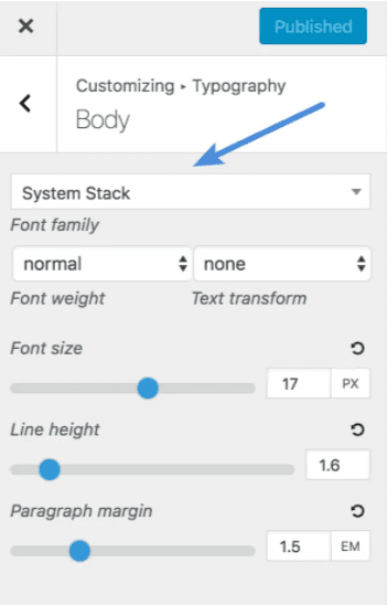
If you’re using the GeneratePress theme (ServerWise clients receive this premium ultrafast theme for free) switching to a system font stack could not be easier.
Click into the Customizer and select Topography and System Stack. You’re done!

WordPress
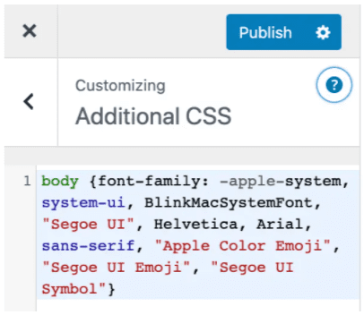
You can use the WordPress Customizer to override the font-family with your new system font stack.

Use A Plugin
If your theme is a little complicated, or you’d rather not risk any code changes, you may find the Disable and Remove Google Fonts plugin helpful. It does exactly (and only) what it says, and it does it well.
System Font Stack Examples
I’ve included a few of my favorite system font stack groupings to make the transition easier on you. Do with them as you wish!
Booking.com
font-family: BlinkMacSystemFont, -apple-system, Segoe UI, Roboto, Helvetica, Arial, sans-serif;
Bootstrap.com
font-family: -apple-system, BlinkMacSystemFont, "Segoe UI", Roboto, "Helvetica Neue", Arial, "Noto Sans", sans-serif, "Apple Color Emoji", "Segoe UI Emoji", "Segoe UI Symbol", "Noto Color Emoji";
GitHub
font-family: Inter, -apple-system, BlinkMacSystemFont, Segoe UI, Helvetica, Arial, sans-serif, Apple Color Emoji, Segoe UI Emoji, Segoe UI Symbol;
ServerWise
font-family: -apple-system, BlinkMacSystemFont, "Segoe UI", Roboto, Oxygen-Sans, Ubuntu, Cantarell, "Helvetica Neue", sans-serif;
Unsplash.com
font-family: -apple-system, BlinkMacSystemFont, San Francisco, Helvetica Neue, Helvetica, Ubuntu, Roboto, Noto, Segoe UI, Arial, sans-serif;
Vercel
font-family: -apple-system, BlinkMacSystemFont, "Segoe UI", "Roboto", "Oxygen", "Ubuntu", "Cantarell", "Fira Sans", "Droid Sans", "Helvetica Neue", sans-serif;
WordPress.org
font-family: -apple-system, BlinkMacSystemFont, "Segoe UI", Roboto, Oxygen-Sans, Ubuntu, Cantarell, "Helvetica Neue", sans-serif;
Switching to a system font stack made ServerWise load faster (even on our already fast optimized servers) and still looks great on every screen.
Now switching over your site shouldn’t take more than a few minutes – 7 minutes at the most in my opinion because I laid it all out for you.
To get started, just copy one of the several system font stack examples I included above and replace the necessary elements in your site according to my simple directions. A few minutes later and your site wide transition to total efficiency is complete.
Of course, if you’re a ServerWise client and feel overwhelmed open a ticket, and we’ll get it handled for you.


Divi and Elementor are popular WordPress visual page builder plugins for a reason, but which is best for your needs? Let’s examine the similarities, differences, strengths, weaknesses and pricing to answer that question. Keep Learning >

We tested Smush Pro CDN, WPMU DEV and Bunny.net and switched to Bunny CDN with no regrets. Faster, flexible, no WordPress plugin required and cheaper. Let me explain. Keep Learning >


