7 Powerful Ways You Can Lock Visitors To Your Site And Minimize Bounce Rates
ARTICLE CONTENTS
- Understanding bounce rates and whether all high bounce rates are a problem.
- How to tell the good from the bad bounce rates.
- Determining your bounce rate.
- Focus on Above The Fold content and optimize it.
- Is every page on your site scannable to the viewer?
- Avoid cheap hosting and go with optimized business-class providers instead.
- How does your site look and load on desktop, tablet and mobile screens?
- Are you using high-quality and relevant images on your site?
- Are you using videos to sell or explain or introduce your company, brand and/or product?
- Do you have content that forces individual engagement?
- Do you know if you’re targeting the right keywords – short and long-tailed?
- Are you using pop-ups and slide-ins responsibly?
Because it’s important that we’re all on the same page let’s agree on what bounce rate means.
According to Google, a “bounce” is a “single-page session on your site.” Meaning, when a person visits your site and leaves almost immediately without doing anything else – without clicking into a second page of the site. A quick drop-in and bail situation.
A “bounce rate” is the total number of visitors to your site who drop in, do nothing, and leave without looking around.
You can have a strong website with a good sales structure and a great product but still have a high bounce rate.
Is A High Bounce Rate A Problem?
It can be…but not always. As in all aspects of life, there are exceptions.
A high bounce rate hurts your SEO because Google and Bing take into consideration page interactions as part of user experience on your site. Simply put, if you lower your bounce rate, you’ll increase your page rankings along with your leads and sales. In short, there’s no reason not to focus on lowering your site’s bounce rate. This of it this way – a high bounce rate signals to the search giants that your content isn’t meeting the expectations of your visitors, and that’s a ding on your credibility.
Now let’s discuss the exceptions.
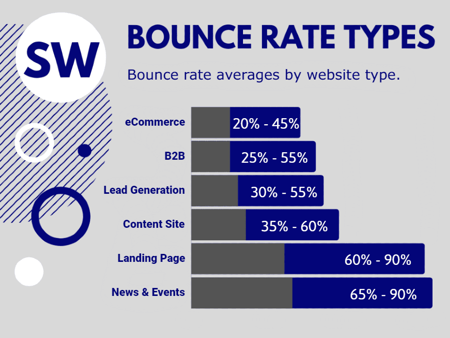
News Posts: Sites specializing in content only either niche posts or news will always carry a higher bounce rate – 65% or more in fact. Visitors click in for a specific post or article, devour the content and leave satisfied. Nothing wrong here.
Specific Pages: Certain pages on a site will always have a high and accepted bounce rate because they’re action-based pages. A visitor goes to the page to accomplish a task and once completed exits the site. These pages include contact us, confirmation page, checkout and form submission pages.
How Can You Tell The Good From The Bad Bounce Rates?
When you set out to analyze your bounce rate, you’ll first look at your Google Analytics dashboard, and you’ll reach a few conclusions. Before making too many changes to lower your bounce rate, be aware that not everything may be as it seems. A website’s traffic data only provides part of the picture.
A higher than average bounce rate may not be a negative, whereas a low bounce rate may not be the big positive you think it is. Confused? Let’s look behind the numbers.
Ask yourself the following questions:
How popular is the website?
As a site gains in popularity, the traffic sources also become more diverse. Visitors flocking to the site from multiple sources to absorb content and leave with a feeling of satisfaction. If the site has a large social media presence with many people sharing specific content that is driving traffic to the site, the bounce rate will and should be higher. They click the link, gobble up the specific content, and leave. There’s nothing negative about that experience for the site or the visitor. It’s building a brand and creating name recognition and trust, which converts to credibility.
Is the site a portal?
Portal sites often have high bounce rates on their homepage. Interested visitors that have clicked into specific articles in the past are now typing in the URL and heading to the site directly. They browse the content above the fold and leave satisfied, most likely to return the next day.
Does the site have monetized outbound links?
When a visitor leaves the site it’s considered part of the bounce rate, but when that site or page monetizes space with CPC ads every time a visitor clicking an outbound link, the site gets paid. This means the higher the bounce rate, the more money the site is most likely generating. In this case, a high bounce rate of 90% is a great thing.
Different Websites Have Different Average Bounce Rates
The search engines understand that bounce rates are and should be unique to the specific type of site or page. Landing pages will always have a much higher bounce rate than an eCommerce store, for example.
How to Determine Your Bounce Rate?
This can get a bit tricky. Take a look at your website stats either through your stats dashboard or Google Analytics (unless you use a heat mapping service which makes this much easier).
Have you noticed any of the following when looking over your site stats?
- High number of site visits from unique IPs that jump onto one page and leave immediately?
- Visitors that frequently click the back button to leave your site?
- 45%+ of visitors who click into one page of your site or store and exit within a couple seconds?
If you found yourself nodding your head to any of the above examples, it’s time to get started on lowering your bounce rate.

Focus On Above The Fold And Optimize It
Although Above The Fold was coined by the newspaper industry to describe the content visible on the top of a folded newspaper, it has taken on new life (similar meaning) in digital marketing.
This is the content that is immediately viewable when a visitor clicks into your website without scrolling down. This is the content that your visitor focuses on, so this is the content that will carry the most relevancy and meaning to their experience. Make sure this content is not just highly relevant but explains exactly what your service is, products are or purpose of your site.
Now, the fold-line varies from device to device, but the general rule is roughly 600 pixels high and 1,000 pixels wide.
Make Every Page and Post Scannable
We consume information immediately and judge rapidly whether reading beyond the headlines, subheadings or bulleted lists is worth our time. Go through your pages and posts and ask yourself if they’re easily scannable.
Did you break up your meaty content with easy-to-read headlines that accurately depict the following content?
Are you using boldface on keywords in your content to grab attention?
Avoid Cheap Hosting and Choose Fast Optimized Hosting
Does The Site Load In Under 2 Seconds?
Site speed is critical, in fact, the speed of your site is the most important factor in keeping a site visitor from bouncing immediately. Consumers expect a site to load in under two seconds.
A high-performing, professional and optimized host is the most valuable tool you’ll have to ensure a fast-loading site. Discount hosts and shared hosts have substantial limitations, after all, we tend to get what we pay for most of the time. A $10 a month hosting plan is not going to give you fast and optimized hosting. ServerWise delivers a fast and optimized VPS hosting platform specially made for WordPress for only $79 a month.
Did you check the site on all screen sizes?
Is the site responsive for desktop, tablet and mobile?
- Desktop visitors have an average bounce rate of 42%.
- Tablet users have an average bounce rate of 54% (12% higher than desktop users).
- Mobile users have the highest bounce rate of all at 58% or 16% higher than desktop users and 4% more than tablet users.
With most site visitors coming from mobile devices a website must be fully responsive for all screen sizes. If using WordPress you can ensure this relatively easily through a page builder such as Elementor, a responsive theme or a specialty plugin.
Are the images and photos relevant?
Imagery is important, but these days it’s even more important that they are highly relevant to your site and its content and must be available for all screen types.
- High Resolution
- Retina Ready
- Responsive
- Properly Sourced and/or Licensed
Tossing images onto your site as we all did twenty years ago doesn’t cut it today. Google knows whether your images are licensed or open-source or stolen. If you ran a quick Google image search and snagged a few photos or graphics to use on your site, it will cost you. Unlicensed use of commercial imagery can (and will) push your site down on the search results. Too much of it and Google will end up blocking your site altogether.
While it is always better to use original photos, if you can’t, make certain the photos or images you are using are fully licensed.
There are many sources online that provide free to low-cost licensed images, including:
Do you use videos on your site?
Videos are the fastest growing and most effective medium today to grab and hold attention.
Most popular sites have long been using video content to lower their bounce rate. If a bounce occurs within the first few seconds, consider how easy it is to keep a visitor on your site longer with just a 45-second explainer video.
Whether an explainer video to introduce yourself, your brand or your product or service or a video sales letter or a series of client video testimonials, an original video that Google cannot find on any other site (YouTube doesn’t count) carries weight.
Do you have engaging content?
Every content marketer and site owner these days are on the lookout for the next big thing in engagement to reduce bounce rate and hold a visitor’s attention. BuzzFeed popularized the online quiz to lower their bounce rate, and it worked (and often still does).
MSN is using quizzes at the bottom of most of their news articles to maintain engagement while capturing valuable data for their advertisers and the Bing Ads network.
Find out how to make your content more engaging by clicking here.
Are you targeting the right keywords?
You can lower bounce rate almost instantly by choosing your targeted website visitor more carefully. Not all traffic is equal. If you own an online yarn shop and use content marketing its essential that you stick to developing content related only to your niche. When you expand your content for social shares beyond your niche you’re going to get traffic from social sites that aren’t interested in what you offer. They pop in, realize you’re a yarn shop, scan the only article you have that they found interesting and leave within seconds. That’s a bounce right there.
You’ve worked hard to carve out a place for your brand in your chosen niche. Keep to that. Any expanding product lines or services must be highly targeted and related to your niche itself.
In my yarn example if the shop owner decided to expand by introducing woodworking designs, content and tools I would advise (if a ServerWise client) that he or she creates a new brand solely for the woodworking niche. Targeting is cost-effective.
Learn more about using (and implementing) long tail conversational keywords to double your hyper-targeted buyer traffic by clicking here.
Are you using pop-ups and slide-ins responsibly?
Pop-ups and slide-ins can be valuable, but less is more. Those handy little lead generators can prove very annoying to people leading many to abandon your site within seconds.
In general, you should have only one pop-up on your site – an exit pop-up. If you move your mouse cursor to exit this page you will see what I mean.
The ServerWise website also uses a pop-up as the main contact us form on every page. We do this because the pop-up can only be triggered when clicked on, and we don’t want our site visitors going to a new page simply to contact us.
Pop-ups have only two useful purposes.
- On exit to entice, redirect or capture leads as they are leaving your site.
- For the convenience of your site visitors and customers.
Anything beyond those two purposes is probably unnecessary.


It’s the sales page where the magic happens. This is the page that gives you a return on your marketing investment. It is on this page where we convert visitors to paying customers. Do you know the valuable elements of a high-converting sales page? You will soon. Keep Learning >

Content marketing is the backbone of the biggest success stories over the last decade. I’m referring to companies like Zomato, Canva, ThinkGeek, HootSuite and even Blendtec. It’s not surprising that so many brands are focusing on content marketing, given the average ROI is twice any other type of digital marketing. Keep Learning >
